It’s not uncommon for us to hear that our coffee roast profile charts look different than a “normal” roast profile.
It’s okay. We’re cool with being different.
In this post we’ll cover a few reasons for the differences and hopefully provide some cool and interesting background comparing commercial charts and the IKAWA At Home, along with a little bit of coffee roasting theory.
The S Shaped Coffee Roast Chart
If you were to google “coffee roast profile” you will see many graphs that resembles this shape:
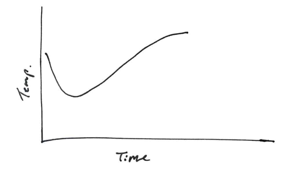
There is a swagger there that’s undeniable – a little dipping and dodging into what’s referred to as an “S” shape.
IKAWA At Home has graphs that take many shapes.
What makes the IKAWA At Home different?
The IKAWA At Home measures the INLET air temperature (the temperature of the air going into the roasting chamber) and the S-shaped graphs are produced when measuring the BEAN temperature during the roast. Home coffee roasters using Artisan roasting software on a popcorn popper, or a home roaster like the Quest M3 or Gene Cafe will be familiar with that shape produced by the bean temperature.
The IKAWA At Home Roast Recipe’s often have sharper changes than these graphs because the sensors used are very quick and allows the roaster to be much more responsive. More on that later.
For those new to roasting, the bean temperature was traditionally the main or only method of tracing a roast. On almost every drum roaster, a temperature probe is placed near the bottom of the drum so sits in the coffee bed while the drum spins around it. This keeps the beans in relatively good contact with the probe and therefore measures the temperature of the beans (or bean mass) as they heat up. That will produce a graph that often looks like this:
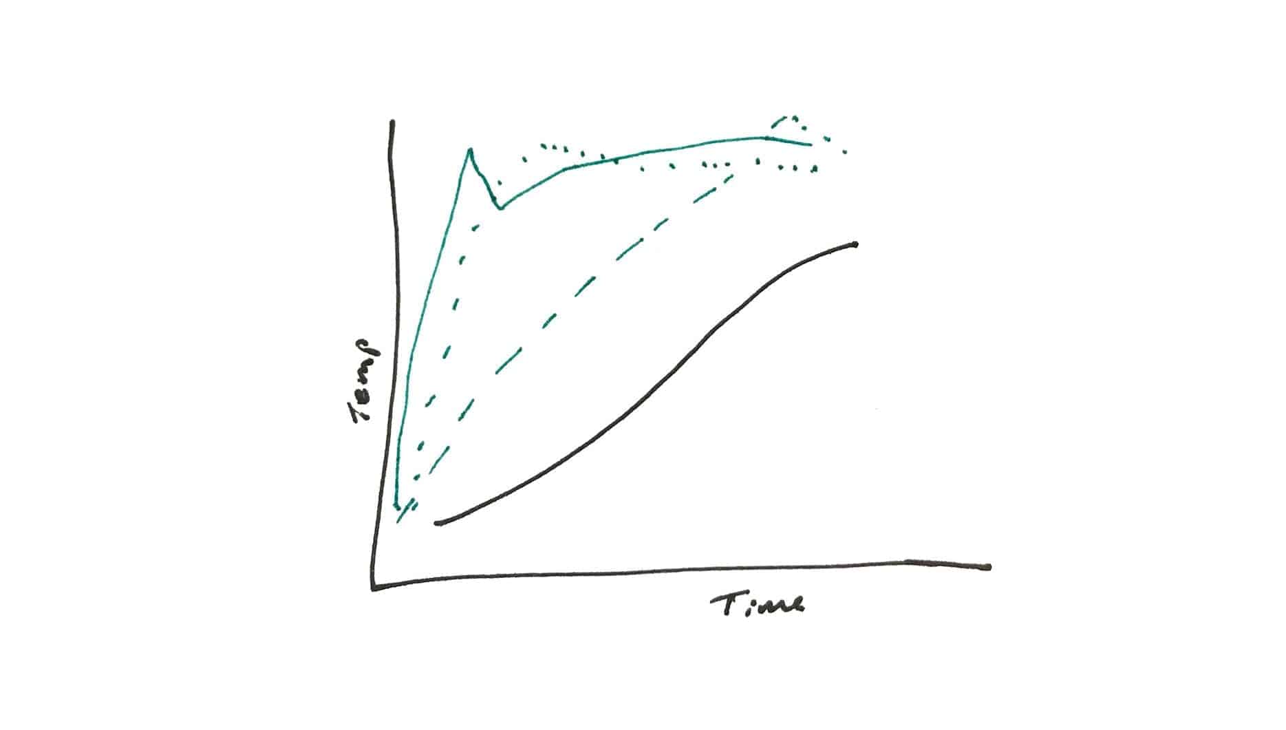
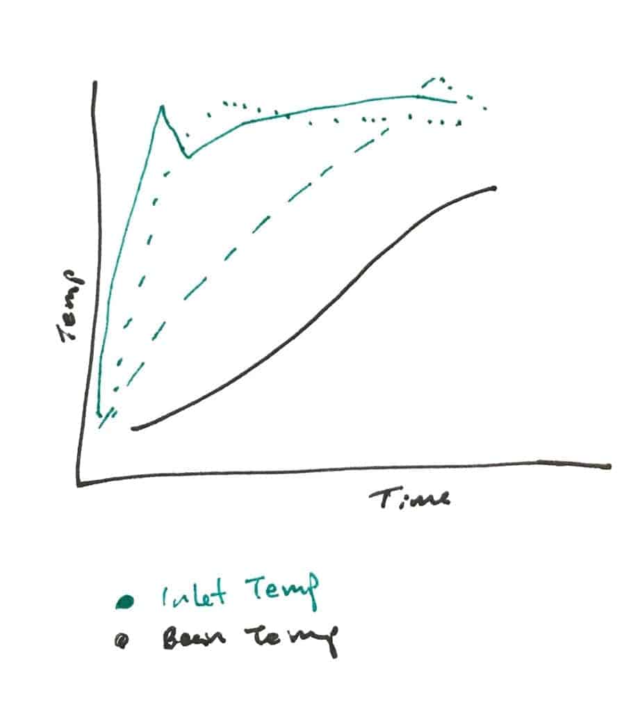
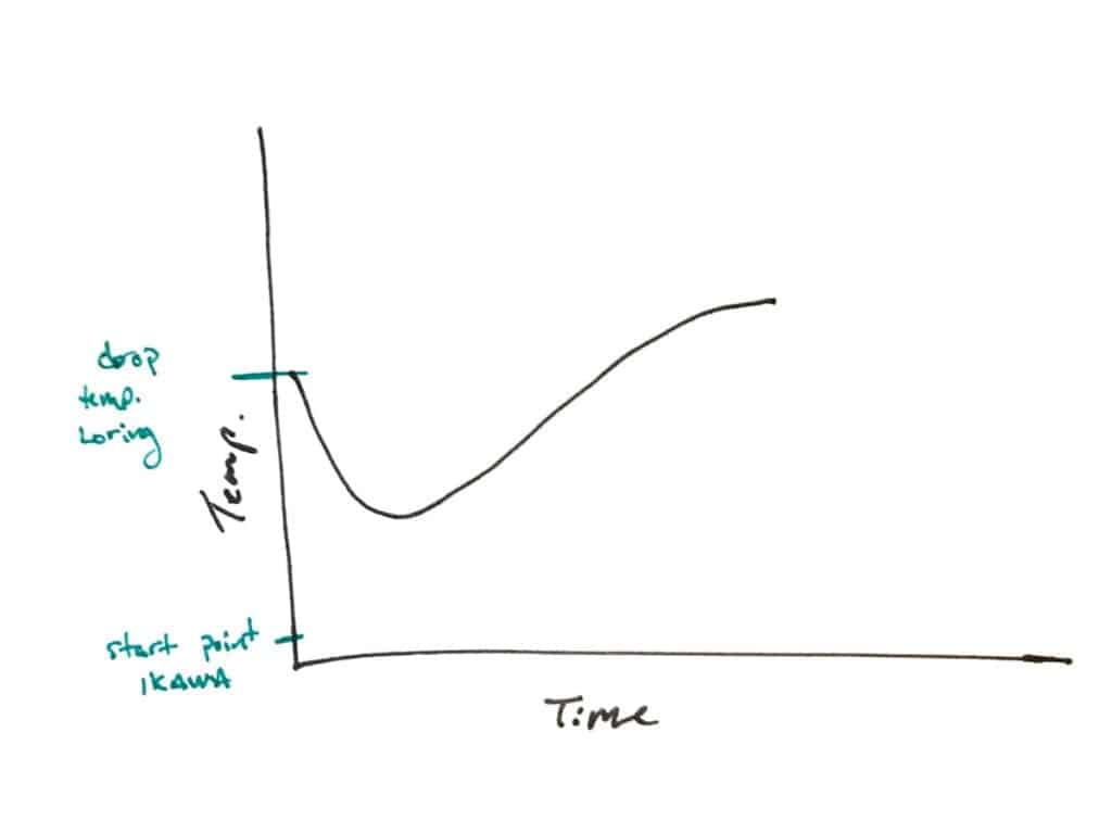
A nice way to understand how the inlet and bean temperatures relate is to look at the graph from a Loring Smart Roast, a 70kg kind of hybrid drum/air commercial roaster where hot air is pushed into the drum rather than the drum heated from below by a flame.
It’s a great roaster to use to outline this because the Loring has a drum, measures the bean temperature and also uses air to roast the coffee, therefore measures the temperature of the air it uses to roast.
The INLET temperature graph ( in green ) from Loring roasts overlays the bean temperature graph similar to this (although can vary slightly):

This illustrates nicely HOW the S curve can be achieved through heat application (the INLET temperature).
Why not to use the S shaped graphs for IKAWA
Two notes about the S curve from the bean temperature (and why it can be misleading to use the graphs that you might find online as a guide):
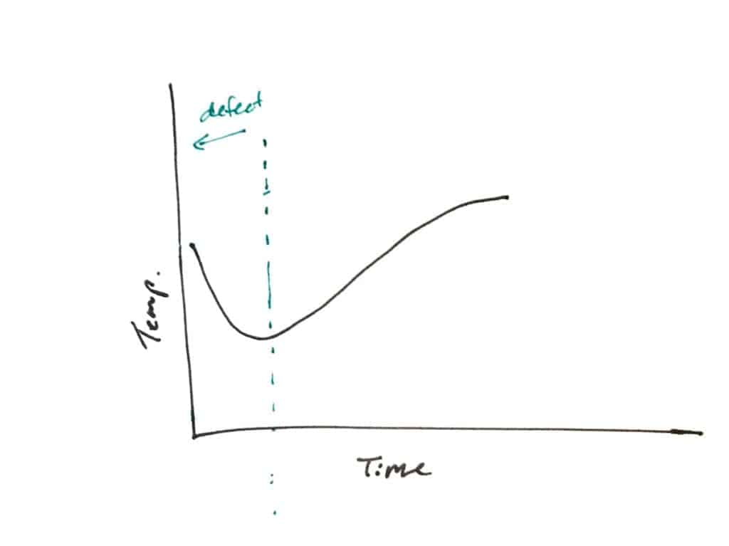
So why does this happen? The bean temperature probe, right before the roast begins, is reading an empty, hot, roaster. This is the reason the bean temp curve begins at a high temperature. The green beans are room temperature so they cool the temperature probe down when they are added to the roaster. Unfortunately, it means that until that temperature “turns around”, the read out is wrong the roaster operator is roasting essentially blind.
Ok, on to the second reason that it can be misleading to try and base an IKAWA At Home profile from a bean temperature graph: almost all the bean temperature graphs will vary because of the probes used.
Because the bean probe is sitting in the bed of beans, the probe needs to be robust and is therefore quite thick. Bean temperature probes can be 1.5mm in diameter, 3mm, 5mm and so on. This build quality affects how long it takes to read a new temperature – that time it takes depends on the type of probe you’re using. Different probes have different lag times and will change the shape of the graph.
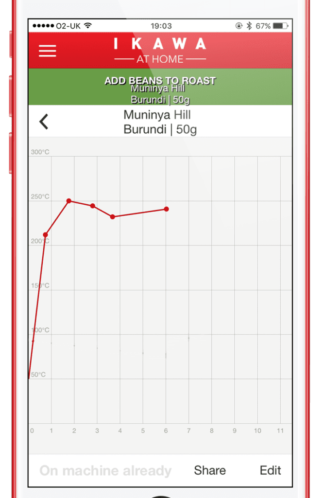
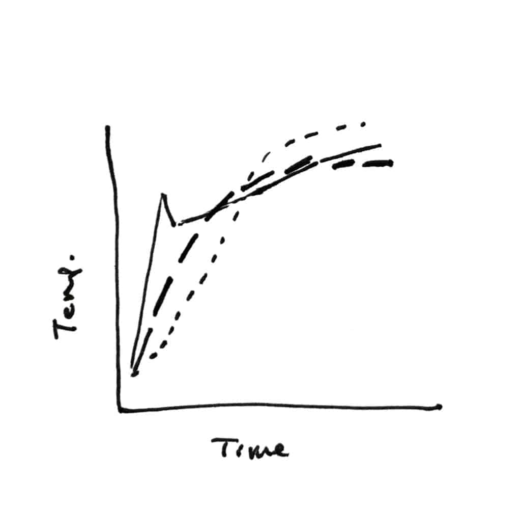
IKAWA doesn’t have a temperature sensor in contact with the beans so it can use very sensitive sensors that provide very quick feedback. The roaster is constantly taking the reading from the sensor and adjusting to keep the roast on track. However, let’s speculate what a bean temperature graph would look like for IKAWA.
Presumably, the graph for INLET and BEAN temperatures on the IKAWA At Home might look like this (with a few different INLET shapes shown):
There’s a bit of swagger there, eh?
One final thought that may help in understanding this – the principles can be related to driving a car. The speedometer is the bean temperature and the accelerator pedal is the inlet temperature control (our profiles, in this case). The relationship between the speed of the car and how hard you’re pushing on the pedal are not simply this than that. Just because you’re pushing hard on the pedal, doesn’t mean you’re going fast. You can be pushing hard to accelerate quickly but still just be at 30km/h.
NB: We have tried roasts on the IKAWA that model the inlet temperature curve on the Loring and it doesn’t work. The roasts come out underdeveloped. This graph of the inlet temp is more flat than an IKAWA roast because the Loring itself retains a lot of heat in the metal and the beans are dropped into the roaster at a very high temperature. The IKAWA begins from room temperature and compared with the Loring (which has thicker, hotter metal surroundings), almost all of the heat the beans will absorb is from the air so is quite different. The IKAWA roasting chamber needs some time to be brought up in temperature.
Happy Roasting